Question 1:
What ways does your media product use, develop, or challenge forms and conventions of real media products?
For my media assignment we were put into groups of three to help each other create a 5 minute documentary as our media product. Our media product uses forms and conventions of real media products in many substantial ways as to create a standard, modern and professional documentary:
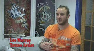
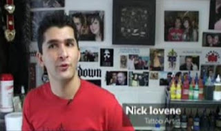
Framing of interview:
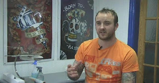
Our interview<<< 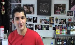
Professional interview>>>
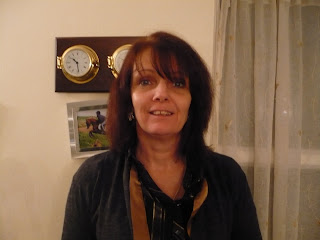
The framing of our interview is a convention which we have used from real media product as, as you can see, it is framed to the right. It is a standard convention for interviews to be framed either to the left or right of the screen, as centre framing is seldom used.
In terms of camera work, the medium close-up is also a convention we have used to frame the interview, and the image of a real documentary beside the screenshot of our own documentary is proof of this – as they have also framed their interview this way.
Our mise-en-scene also follows forms and conventions of framed interviews as it establishes the location and matches the interviews nature. For example, within our interview of the tattoo artist, we have tattoo-inspired posters filling the free space beside him and a desk with boyish/tattooist implements upon it, which work as an extra visual aid and reinforces the tattooists image - Just as the example image does.
Framing of Voxpop:
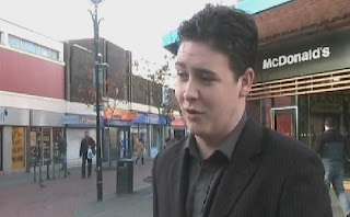
Our Voxpop<<< 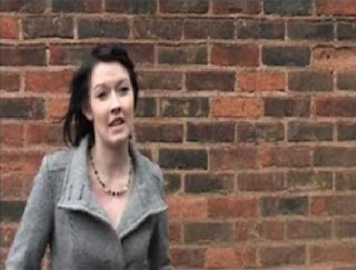
Professional Voxpop>>>
Also conventionally framed to the left or right, and filmed in a location which makes sense with the documentary/the target audience needed to be the interviewees in the voxpop. For example: our documentary was filmed about a shopping area where a range of people of different ages would be found. Also the interviewee needs to be looking at the interviewer, and not directly at the camera. Comparing the image taken from our documentary (on the left) to the professional documentary (on the right), it shows that we have used the framing of our voxpop correctly.
Graphics:
Our Documentary<<<
Professional Documentary>>>
Our graphics were chosen on the thoughts of a tattoo-style related type and colour. Due to the outlook we were trying to portray on tattoos, we chose a rock style, colouring red to connote the passion and danger within getting tattoos/daily tattoo enthusiasts. Again, this is a used convention from other real media documentaries as the type style always needs to match the topic. The fact that the graphics are placed on the left-hand side of the screen is a further convention, as it is again a commonly used technique, which is also shown in the real media documentary image.
Narrative structure:
Our narrative structure uses typical styles of a mixed documentary – where any sort of documented footage applies. For example: Voiceovers for narration, archive footage, interviews and observational images to keep the viewer interested.
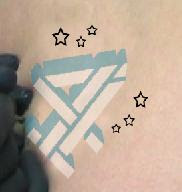
Cutaways and editing:
Using cutaways in a documentary is a common convention as it helps to avoid jump-cuts and can act as a visual aid – e.g. to give the viewer an idea of what our documentary is talking about. Below are images of cutaways we used and why:
 This cutaway was used as a visual aid for the voiceover, to link to what was currently being described: 'They adopted symbols such as swallows...'
 This cutwaway image is a standard jump-cut avoider, used also to match what the interviewee (Manuel Worker) was speaking about: 'Then i got our lord there...'
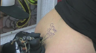
 This is an image of the tattooing needle. This was used in our collection of shots before the tattooist interview to establish the location.
The ways in which we used forms and conventions of editing were as to make sure our documentary looks and sounds strictly professional. Such examples of us using typical editing techniques are cutting out the questions asked by us to the interviewee throughout the interviews. For our style of documentary this slice of filming does not apply, therefore it is a must that it is not present in the final production of our media product. Also, using editing styles between different parts of documented film, for example; cross dissolves, fade to black, and others; are other conventions of editing in documentaries.
Example of a flash being used in another professional tattoo documentary ('Tattoo documentary.mov') between images, such as like we used in our opening titles: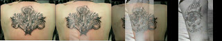
Link to documentary:
http://www.youtube.com/watch?v=VDAgTzHBmQ8&feature=fvw
Running order:
It is a certain rule that all media television programmes have a running order before the programme is even created, as a model to work from. Our group basically stuck to our original design, but deviated from some sections due to complications: we did not include the voiceover section about prison break as we decided it was an unnecessary point in the documentary to talk about it. This also gave us more space within our first 5 minutes of the documentary to show more of the voxpop, which in turn fitted better with the products flow of topic. Our timing for each section of our documentary has also changed, however this is a factor that most probably could not have been avoided, as it is uncertain how long each piece of filming would actually last, especially when it comes to matching our first prediction exactly.
**(All professional images, apart from those noted otherwise, were extracted from the documentary: 'Far Beyond Tattoos Documentary part 1': http://www.youtube.com/watch?v=ao7ORCfibio)
Question 2:
How effective is the combination of your main product and ancillary texts?
Our group has carefully put thought into the spread of coherence throughout our final product as a whole, by creating necessary links between the documentary, radio trailer and the print advert:
Documentary Opening Titles:____Print Advert Titles:

 As you can grasp from looking at all of the examples of the final product above, the main link between them is the documentaries title: ‘The Human Canvas’. This is solid evidence to our audience that the programme that they are watching is the one they have heard and/or seen advertised. Another direct link, between the print advert and the radio trailer, is the tag-line ‘What’s the point?’ which is present in both of these ancillary texts, as is the date and time. Both these visual and audio presentations automatically combine the two texts together, as they inform the targeted audience of the same thing. These connections are effective to lead our audience to the correct viewing of the documentary.
Another combination we have made is the channel 4 logo, present once again in both the print advert and the radio trailer:
Close-up image of logo on Print Advert:
This makes it obvious to the viewing audience/listeners that the channel our documentary would be aired on is definitely channel 4, which again is effective in leading viewers to the right place, for the right time.
We chose a young male voice in particular for the voiceover as it seemed the right match for our documentaries focus, and was within the age-range for our target audience (15-40 years). The voiceover for both the documentary and radio trailer is this same voice used repeatedly.
This links the audio heard by the audience and creates a familiar link whilst watching our documentary. This is effective as it sort of creates a comfort between the viewer and documentary. It is also useful having extracted audio from the voxpop and interview with the tattoo artist, as the audience could also relate to their voices as well, and may unconsciously even create an element of surprise to whom the voice belongs too.
The print adverts main image is the most characterised link to the documentary – as it was obtained from the filming of a girl getting a tattoo done:
Documentary filmed image<<< 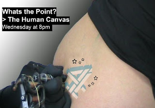
Image used for Print Advert>>>
The use of this image is effective because it was extracted from the documentary itself, and helps to outline our documentaries nature perfectly as it is a blatant visual guide to the detail involved, and the issues our documentary will be handling. Once again, the audience are also able to make a familiarised link between seeing the print advert, and watching the image in action on screen. It may even trigger the question about how we replaced the image on the woman’s body with the channel 4 logo. Combining these two images is yet another creative technique we used to bind the documentary and ancillary texts together, as what you’re seeing is what the programme will contain.
Its just simple little links that have helped us to make a great impact on the effect our advertisements could have for the viewing outcome for our documentary.
Style:
In terms of style, our documentary and ancillary texts address our target audience by using effective techniques which relate to the modern day youth and beyond of society:
--The upbeat music and young male voiceover we have used for our documentary/radio trailer, help’s to address the interest of those with an open-minded nature – to which for people to take interest in tattoo’s, their minds must be open to new options and opportunities, making our choice immediately effective.
--Our use of colour is effective within our products as we have used a wide range throughout the documentary/print advert. For example: Our opening titles are a variation of colours, and since a colourful background is a modern theme at the moment, this helps to address the right sort of attention to detail in our product from the audience.
--Our use in visual aids (imagery) is also concerned with attracting our audience. The collections of images used for cutaways in our documentary were carefully selected to appeal to our target audience: Flowers, birds and animals for the light-hearted; and skulls, webs and other such tattoo images for the rather more hardcore viewers. Also, the main image for the print advert is eye-catching and intense, and it is displaying the actual tattooing process – an image which many of our targeted audience may not have seen yet. This could effect the amount of attention our documentary seeks by an increased value.
Appeal:
When and where would the radio trailer be played and the print advert placed?
Radio Trailer:
Commercial radio stations: 
Print Advert:
Newspapers – The Sun, The Independent, Daily Express, The Guardian, Metro, The Mirror, The Star, The times, etc. Aimed at both a broadsheet and tabloid audience.
 Our print advert also could potentially be used as a billboard; if we had the option to stretch our advert to other media, as due to the size and shape of our image it is the right shape to enlarge to become of billboard quality.
Question 3:
What have you learned from your audience feedback?
For our audience feedback we needed to set up a documentary viewing with people from our target audience. To do this, we asked people from outside the lesson to come into our lesson and watch our documentary, afterwards asking them a short list of questions about it – to gain our feedback. We asked them 5 questions on the documentary, and one question each on the ancillary texts. The questions we asked our audience and the answers retrieved from our audience are as follows:
Documentary:
Q1) Did you enjoy the 5 minutes of our documentary?
"Yes i thought it looked very proper, you have obviously put a lot of thought and effort into it."
Q2) Were there bits of the 5 minutes you would like to change?
Music in the interview a bit too loud - 2nd interview
Q3) Do you think it looks like a professional documentary?
Y es (80%),
"The first bit before the title is good. Also, the way the music goes slow and then fast generates a creative pace."
Q4) Would you consider watching the rest of the documentary?
Yes (100%)
Q5) What are your opinions on the product overall?
"Very professional";
"Interesting";
"A lot of effort put in"
 "I especially liked the way you used different body parts to create an actual human canvas, it gave your production more of a means to be about the body being an art itself, instead of just the tattoos"
Print advert:
Q6) Having seen the print advert, what do you expect to see in our documentary? "A Debate – the Pro’s and Con’s of tattooing";
"Why tattoos exist in the first place";
"What tattoos are and what they mean to the world"
"How tattoos are drawn and where they originate from"
Radio Trailer:
Q7) Does the radio trailer capture your attention and make you want to watch the programme?
Yes (100%)
From looking at the audience feedback, it tells us that the style of or documentary is professional in terms of the layout and the selective pace for our audio and film. This informs us that we have the right idea about how the documentary should look and the formation is proficient for television viewing.
However, there are weaknesses with our documentary found by our audience, such as question 2 which states that the music is too loud in the second interview. To improve this we will need to either enhance the voice of the interviewee if it is too dim, or decrease the volume of the background music/get rid of the music altogether if that works better. By doing this we will be making the viewing more comfortable for our audience.
The most important answer obtained from our audience I think is from question 7, to which a person answered that they would watch the documentary if they were ‘interested in tattoo’s’ (which this person is). This is very significant information to do with our product as it tells us that we are hitting our target audience, which are basically people with an interest in tattoos/people who have got tattoos. To strengthen the outcome of this question however, I could ask more people within our target audiences on their views to reinforce this answer, and also even ask the opinions of people outside our targeted audience, to see if we could regulate more interest than just from those within our target audience.
Another strength in our work found from the audience feedback is the answer to question 6 about the print advert, where they have answered that they’d expect our documentary to be a debate on the Pro’s and Con’s of tattooing – which is right. The content of our documentary includes more information on tattoos than just this though, which could be a further strength, as it could come as a positive surprise to our viewers. The tag-line on the print advert states: ‘What’s the point?’ This is a rhetorical question, and tells the viewer that whether or not it’s going to be answered; to find out they’re going to have to watch the documentary – which is a positive pull into gathering more viewers for our product.Question 4:
How did you use media technologies in the construction of research, planning and evaluation stages?
Video Camera:
Still Image Camera:
Voice Recording Technology:
Microphones:
Tripod:
Adobe Premier Pro:
Adobe Photoshop:
Adobe Audition:
Internet:
The internet was used to obtain Archive Material such as the marine tattoo images within the opening section of our voiceover. It was mainly used for research and planning however, as the search engine allowed us to gain a load information about the history of tattoos and other related topics in the documentary.


 This cutaway was used as a visual aid for the voiceover, to link to what was currently being described: 'They adopted symbols such as swallows...'
 This cutwaway image is a standard jump-cut avoider, used also to match what the interviewee (Manuel Worker) was speaking about: 'Then i got our lord there...'
 This is an image of the tattooing needle. This was used in our collection of shots before the tattooist interview to establish the location.


 es (80%),


