To create the print advert, we first needed to come up with a drawn-out idea to base our design on. Some ideas we came up with were:
- Having the documentary title 'The Human Canvas' being tattooed onto a persons skin, the portray the programmes topic.
- Having the Channel 4 logo being tattooed onto a person's skin, again portraying the programmes topic except probably more ideal to try.
The idea we finally decided on though was as follows:
- Having the Channel 4 logo being tattooed onto a person's skin, using a print screen image of the woman getting a tattoo in the documentary to be the main image, with the titles and scheduling to be fitted in the space above the woman's back.
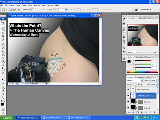
On Adobe Photoshop, i then began to edit the Print advert. First i took a screenshot of our main image from the documentary, of the woman getting a tattoo. I then cut the image out on Microsoft word, pasted the new image onto Adobe photoshop, and enlarged it to fill the editing window. After this, using the lasso tool i then began to cut out all the sections of the image we didn't need (the background of the tattooing area), leaving the woman's back and the tattooist's hand in the shot.
- Having the Channel 4 logo being tattooed onto a person's skin, using a print screen image of the woman getting a tattoo in the documentary to be the main image, with the titles and scheduling to be fitted in the space above the woman's back.
On Adobe Photoshop, i then began to edit the Print advert. First i took a screenshot of our main image from the documentary, of the woman getting a tattoo. I then cut the image out on Microsoft word, pasted the new image onto Adobe photoshop, and enlarged it to fill the editing window. After this, using the lasso tool i then began to cut out all the sections of the image we didn't need (the background of the tattooing area), leaving the woman's back and the tattooist's hand in the shot.

I then began to erase the woman's tattoo on her back by using the stamp tool, to take a sample of the colour of her skin and stamp it across the tattoo which hides it and makes it look as if her back is then bare:


This then gave me a blank canvas to paste my own tattoo onto - the channel 4 logo. I obtained this image from the Internet, and once again using adobe photoshop and the lasso tool cut around it to get rid of the white background:

I then dragged the edited channel 4 logo image onto my print advert, and enlarged it, placed it under the needle and tilted it slightly, to give the effect that it was being tattooed onto the woman's skin:


Next was the titles and scheduling. Trying to follow the forms and conventions of a typical channel 4 print advert, i planned to have a plain white text over a coloured box - preferably black. So that is what i did, using the rectangle tool to draw on the box, i then began to type up in 'Arial' font the title of our documentary, tag-line and scheduling, and arranged the boxes as shown:


The arrangement was then changed though as this did not seem to fill the canvas appropriately to attract attention. I also made the channel 4 logo smaller as it seem to look too big for the conventional size. The preferred arrangement then consequently became as follows:

I then gave the print advert some background colour, using the gradient tool and choosing a black/white contrast to give our print advert more presence. After that i changed the colour of the channel 4 logo from black and white to blue and white, as this is also a more modern design commonly seen, and as to add a bit more colour to our product:

Following on with this change, i altered the opacity of the logo, to make it look more as if if was actually printed on the skin:

I then tried changing the stokes on the outline of the logo to give it an even more 'tattooed' texture, looking at angled strokes and sprayed strokes, finally deciding the sprayed strokes looked best:


By now i was just about completed with my print advert, but there was something missing. This is when i added the final touch - the star shapes about the channel 4 logo, using the shapes tool - to give our tattoo more of an interesting design:

The Final Production of the Print Advert:

No comments:
Post a Comment